Airport Website
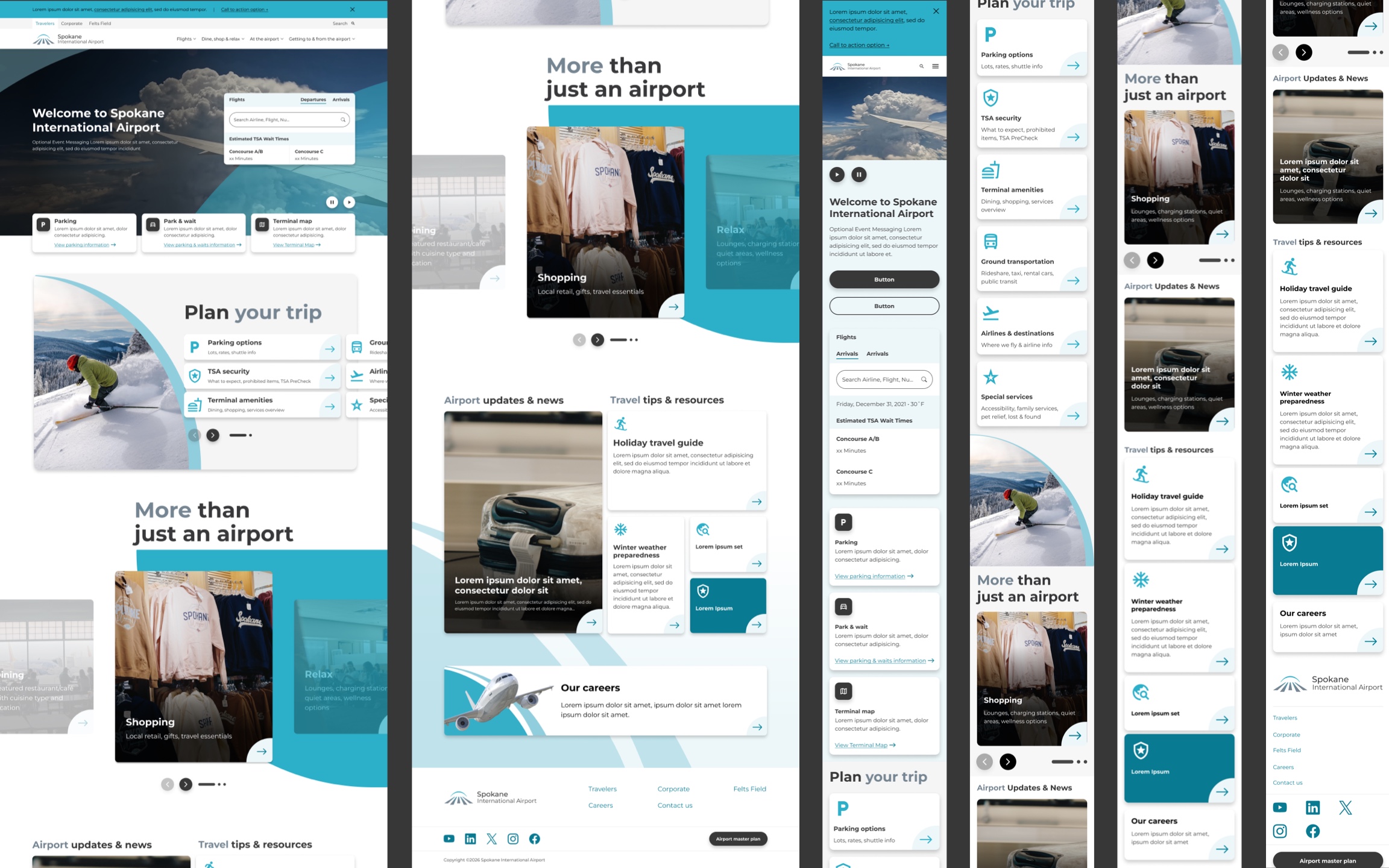
Concepts that showcase common services for airline customers, and unique features and announcements specific to the airline.
Mood boards
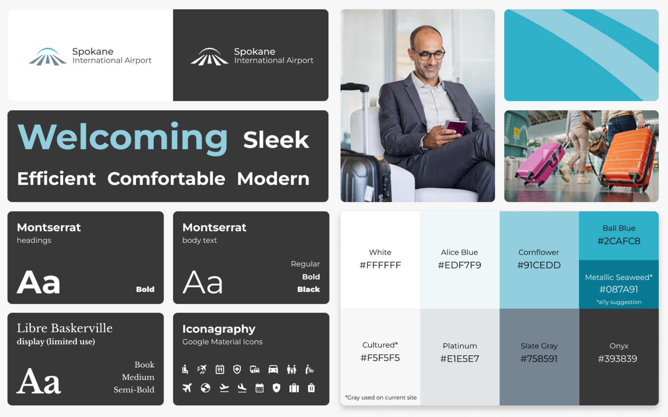
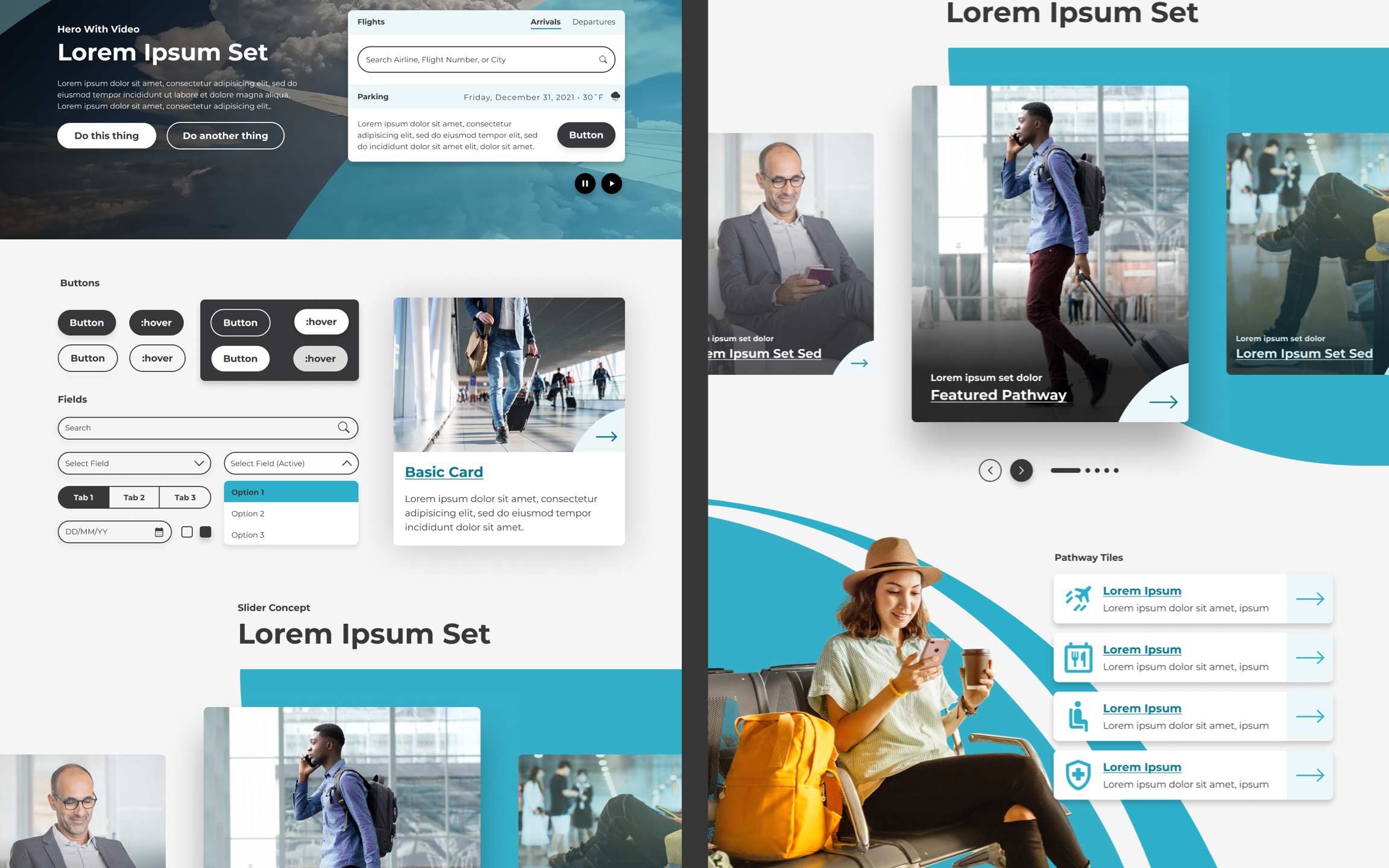
Focused heavily on the dark and cool colors from Spokane’s brand to provide a more professional and modern look. Higher contrast colors were given priority or darkened to ensure a11y contrast was met. Photography of smiling customers and bright scenery were prioritized in order to provide a provide a positive a positive digital experience. Components utilized arch-style graphics to visually reference the logo and established brand aesthetic.
Design Examples
Hero section focused on providing actions that airports’s users considered paramount: searching for flights, parking, and navigating the airport. Copy was included to help provide context to the actions and background video was utilized to demonstrate airport’s primary services.
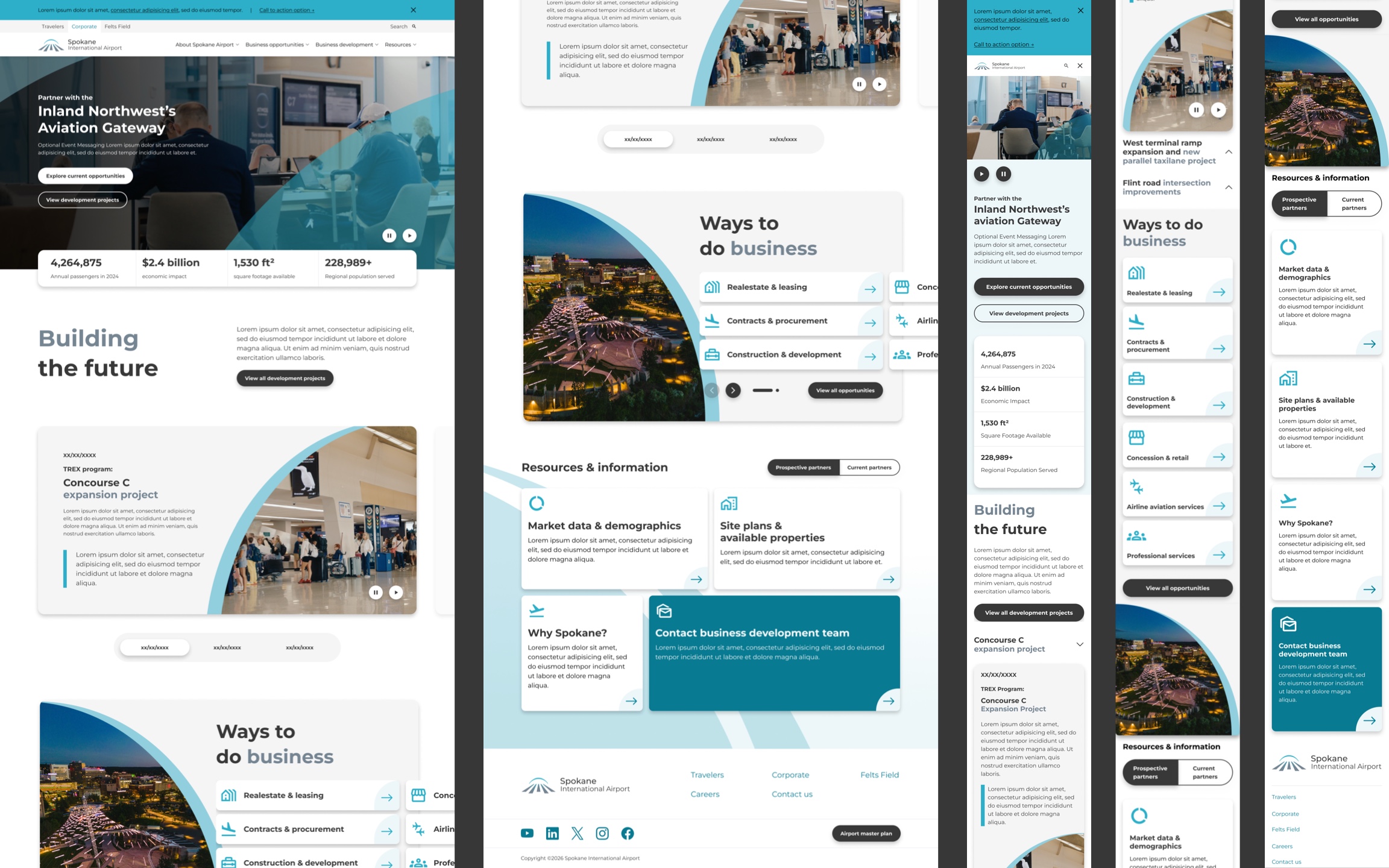
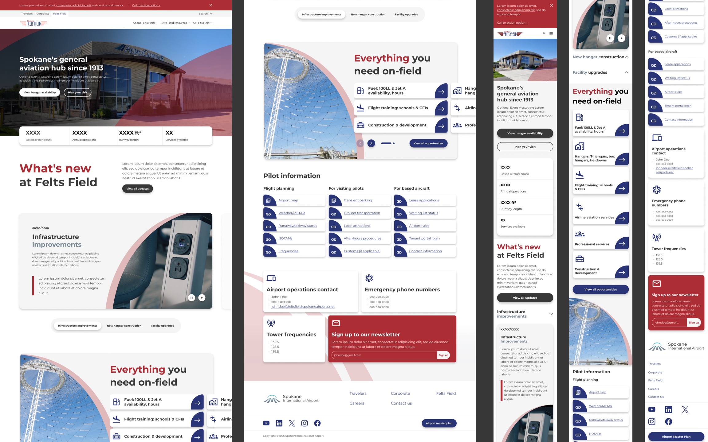
Design system created for related airports to ensure common UX patterns are utilized across deigns and establish a recognizable visual aesthetic to reduce cognitive load.
Designs of the entire project can be downloaded as a zip. Download all designs.